Brand Assets
A comprehensive guide to maintaining brand consistency across all touchpoints.
A comprehensive guide to maintaining brand consistency across all touchpoints.
Our typography system combines Neuton serif for headlines with Barlow for body text. This pairing creates a perfect balance of authority and approachability, reinforcing our brand's professional yet modern character.
Neuton is our serif typeface for headlines, providing elegance and authority.
Used for main body text and long-form content where readability and clarity are essential.
Our color palette is vibrant and energetic, reflecting our innovative approach and creative spirit.
We use one set of colors for text and another for everything else to ensure strong contrast. This keeps everything accessible and easy to read.
Colors should be used in proportion to their usage in this diagram. To maintain harmony among the brand, colors on the far right should not overpower colors on the left.
Dark Blue (#122C3C) serves as our primary brand color for foundations and key elements. Green (#22B161) provides energy and emphasis for CTAs and interactive elements.
Secondary colors add energy and variety, but they should be used sparingly. Use them for accents, illustrations, and to help create visual hierarchy in complex layouts.
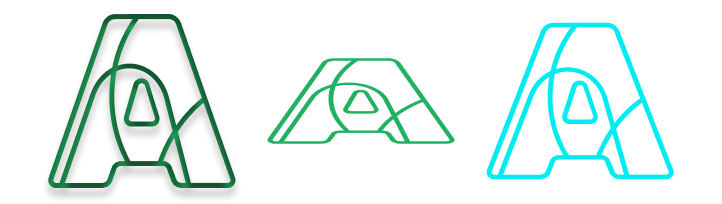
The Augusto logo is a core element of our brand identity and should be used consistently across all applications. It has been designed for flexibility while maintaining clarity, recognition, and visual integrity in both digital and physical environments. For small-format use, apply the logo lockup without "digital" to maintain legibility.
Best used in banners, website headers, or other wide layouts where space is horizontal.
Ideal for stacked layouts or narrow placements where height works better than width.

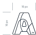
A simplified mark for small-scale applications like app icons, favicons, or watermarks where the full logo would be unreadable.
In scenarios where the outlined bug is unreadable, use the filled in bug for increased readability.
Never display the logo smaller than 32px in height for digital or 0.5 inches for print.
Maintain a clear space around the logo equal to the height of the letter 'A' of the word mark.
Never rotate, distort, recolor, or add effects to the logo.
Use the primary green logo on light backgrounds for maximum visibility and brand recognition.

For dark backgrounds, use white or green variations to maintain contrast and legibility.

Augusto Digital's style is modern, approachable, and professional, combining clean, minimal design with bold accents that convey innovation and clarity.
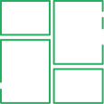
Our iconography style is simple, geometric, and friendly. Icons should be clean and minimal, using 2px strokes with rounded corners.
Figma’s MCP server gives AI code agents direct context from Figma so they can generate code faster and more accurately by matching our designs and our existing design system.
To get connected, do two things: enable the MCP server in Figma, then connect it from your editor (it supports multiple editor clients).